Economics for five-year-olds; data visualization for adults
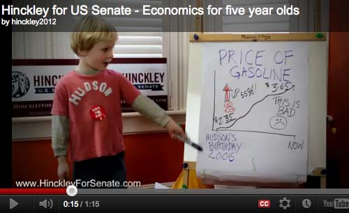 |
| Hudson Hinckley explains gas prices; reproduced for commentary and criticism. |
This week, RI Republican Senate Candidate Barry Hinckley released a campaign spot featuring his five-year-old son giving an economics lecture, and there's something not quite right about it. While most commenters have focused on the bizarre followup interview he and his son gave with Fox's Neil Cavuto, where Hinckley appeared to be lip-synching his son's responses like Fats in Magic, I was more interested in the chart the boy shows in the still frame, above, of gasoline prices from 2006 to the present. It's just, well, fundamentally misleading.
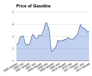 |
| What the data actually show. |
I can understand that a five-year-old doesn't know enough to label both the axes, or make sure his line crosses the origin. And, granted, I'm a bit of a chart geek (after all, I slammed the chair of the Portsmouth School Committee for showing a chart with a distorted Y axis). But that's just not what the shape of the line looks like, either in outline or detail. Based on numbers from the US Energy Information Administration, it should look like this chart over here.
I can forgive a lot from a five year old. A Senate candidate? Not so much.
I expect that the person who represents me in the Senate knows how to plug numbers into Excel. And doesn't pretend that they can bend the curve for political gain. The "why" of rising gas prices? Mother Jones has a good explainer.
Check my numbers:
Worksheet on Google Docs; data available from the US Energy Information Administration
Full disclosure: This is the kind of geekery I indulge in on Friday nights. Also, I'm a Democrat and supporter of Sen. Whitehouse. And not just because he came to my local supermarket to talk about helping working folks, or took the time to talk to my son about his experience in Mock Trial.